Pulp
PULP LIQUIDE stands head and shoulders above the many sub-standard cheap imports that occupy the e-cig vaping market.
French made with authentic and natural flavours. The branding reflects the quality ingredients and design aesthetic behind the company and positions PULP LIQUIDE as a high-end quality product for the discerning vapeur.
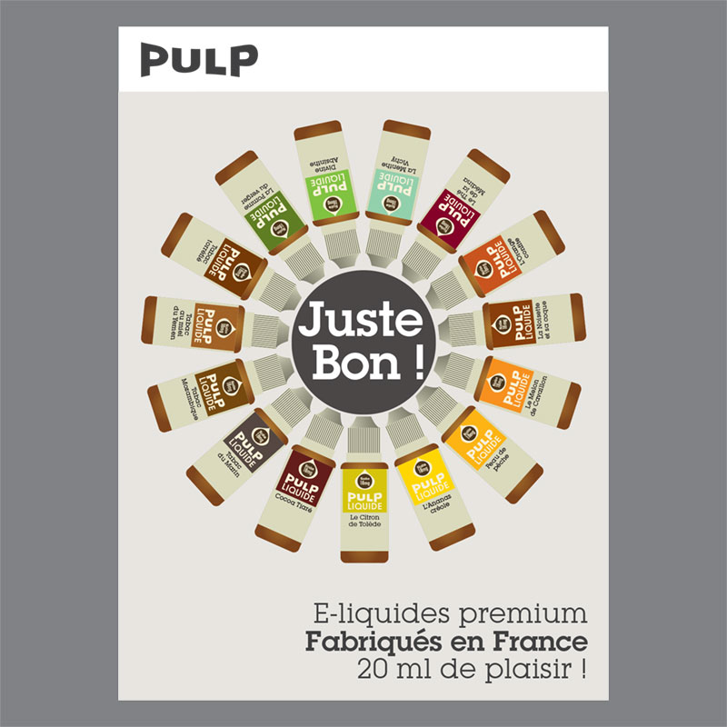
Brand Identity, packaging and launch poster.

PULP Liquide: Launch poster

PULP Liquide : Packaging

In order to give the text the necessary symmetry was necessary to modify the letterforms individually. The devil is in the detail!
