Healthcare computing
Hc+ is a specialist IT infrastructure supplier based in Hampshire, England.
Craftyfish undertook a strategic re-naming of the company from Healthcare Computing to Hc+ This enabled the company to take advantage of the changing digital workplace and to be presented as a technology innovator.
UPDATE: Since the original implementation the company has changed the corporate colour from green to blue.
Visual identity refresh, website and marketing materials.

HC+: 3D render of logo.

Hc+: Logo variations.

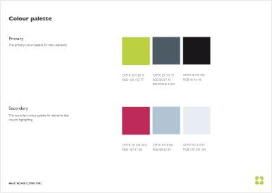
HC+: Colourways

HC+: Business card.
