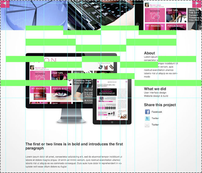
I don’t know about you but I just had a flashback to 1984!
When, for experimentations sake I overlaid some grid combinations that I had concocted for my current web project it took me back down memory lane. Maybe it’s just a geeky/nerdy (delete as appropriate) designer thing but I was instantly reminded of iD magazine. It could be a trick of the mind, maybe it was Face magazine instead but no matter, I got my thrill.
Forget the content, as clearly iPAds et al are not 1984 at all. It was the blocks of fluro green that overlaid the magazine-like layout. It’s a thing of beauty.
I only wish I could present it to the client with some kind of rationale that they could buy into ;-). Naturally I had to check if my mind was indeed playing tricks so I typed ‘id magazine 1984’ into Google. And voila! Check out that green- it’s uncanny! Are you curious enough to do the same?
Oh, actually this post was meant to be about the organic nature of grids but I rather like the direction it has taken so i’ll keep that little nugget for another day!

