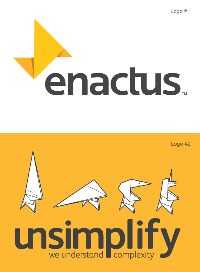
Two logos. Two years apart. Different Designers. Similar result.
While perusing the quite wonderful site Brand New, (like one does in order to stay ahead in this game), I came across this new(ish) identity from Landor. (logo #1)
Nothing special you might say. You may be right. You may be wrong. Either opinion is ok as healthy discussion is good. No, the thing that resonated with me was the similarity to something I did for an Agency in London in 2010.(logo #2) It was almost if the Art Director from Landor had been spying on my design process from the cupboard under the stairs. Ok, I don’t have a cupboard under the stairs! It’s called Artistic Licence.
The logo is based on the art of Origami. A clever idea that has the potential to open up a multitude of possibilities. And look, they’ve used a ligature too!
Lost marks for not including a Unicorn though- I think the marrying of Unicorns and Origami hints at something a little out of the ordinary. An alternative take on the world. A different view on problem solving if you like. Unfortunately, this particular direction never made it past the drawing board. The Agency decided on a different naming strategy so this was binned.
C’est la vie.
